


|
|
|
NAME: My idea for the name is either the Perth Redbacks, West Australian Redbacks, or the WA Redbacks. For the benefit of the possibility of being in the NRL in 2012, I would prefer the Perth name, but as the name will be representing the WARL in interstate matches in 2007, the Jim Beam Cup (2008-2009), and possibly the Queensland Cup in 2010-2011, I would probably prefer the WA Redbacks name. It would be unique in top-flight sporting competitions in Australia, as all teams from Western Australia are either the Perth ________ (Wildcats, Glory, Heat, Lynx, etc), the Western ________ (Warriors, Reds, Force), or the West Coast ________ (Eagles), should they become successful in reaching the NRL Telstra Premiership competition in 2012. The Redbacks is also a kind of throwback to professional Rugby League's earlier attempt at a Perth team - the Western Reds. The name could be looked at as saying the Reds are Back, but maintaining enough difference to be a completely seperate entity - which this most certainly is. Redback spiders live in abundance in Western Australia (check my backyard for proof!). They are silent and small in stature, but are deadly and everybody fears them - all characteristics I feel would suit the new WA team. 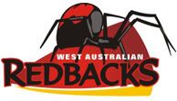 Idea #1: A red background that points west (and more specifically in a southern-west direction where Perth is located). Gold kinda thrown in there to keep with my chosen colour-scheme. The red on the spider's back is in the shape of the letter 'W' to represent WA. The spider is also walking from left to right to show it is moving forward.  Idea #2: Same as above, but with the gold colour integrated more into the logo, which in turn also makes the name REDBACKS stand out more.  Idea #3: Similar idea as the above two ideas, but the red background has been replaced by a golden one (as in 'WA: The Golden State' as it promotes itself). Colours more predominantly black and gold (WA state colours) with red still playing a major role. The text at the base could easily be substituted for West Australian or WA - depending on the decision reached. This is my 2nd favourite of the logos I have designed. 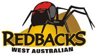 Idea #4: As above, with the exception being the 'West Australian' text is curved to flow with the logo. 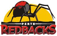  Ideas #5 & #6: These two logos are my personal favourites - particularly #6. In these logos, there is a big golden sun in the background. The golden sun and black box underneath is also a subtle throwback to the Western Reds logo. |